SLA
SLA
Directions
Scene 1 (Main Menu) : Main Menu Scene - Click the Start button to enter the game. Click the Overview button to view the brief introductions of the three game scenes. Click the Credit button to view the detailed information of the game creator. Click the Setting button to control the size of the background music and click the size of the sound effect. Click the Help button to view the game description and help information.
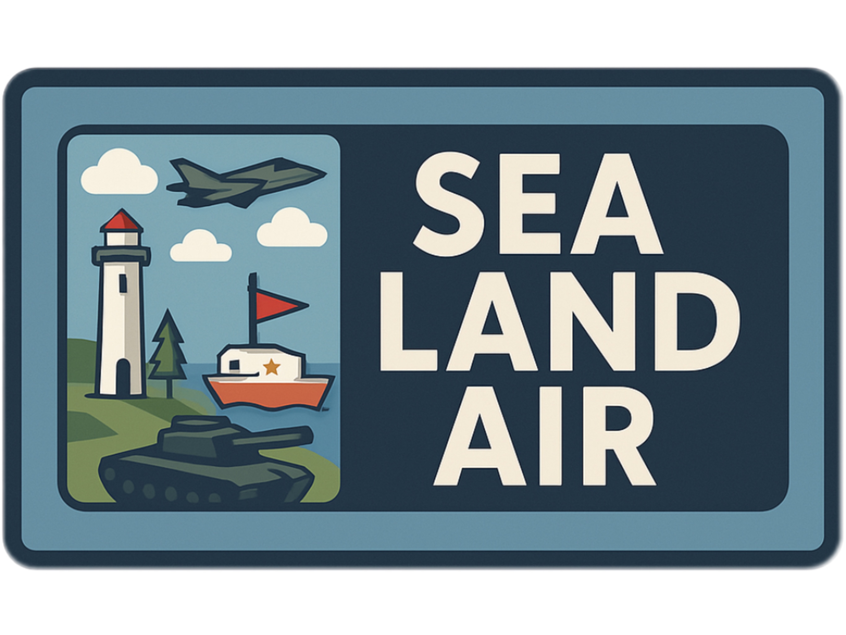
Scene 2 (Boat) : Sea Scene - Players drive boat shuttling among multiple small islands to simulate the floating of real water bodies. This mode emphasizes the combination of flexible movement and survival challenges.
Scene 3 (Tank) : Land Scene - Players drive the tank in the battlefield composed of forests and camps. Players need to kill the targets and test their operational reactions and movement strategies.
Scene 4 (Warplane) : Air Scene - Players will control the warplane in the scene and conduct high-altitude shooting through lifting, turning and advancing. This scene highlights stereoscopic maneuvering operations and aerial shooting.
Game Scene (Scene 2, 3, 4): There is score information in the upper right corner of the screen. On the left side, there are time information, player health information and two buttons. The Setting button can be used to replay the game and return to the home page. The Help button can be used to view player control information and monster information. There is a panel at the bottom of the screen, which contains a scene introduction and two buttons for switching scenes.
UX and UI discussion
1. Clean and Clear
The interface is minimalist, focusing the player's attention on core interactions such as shooting and movement. All menu buttons are clearly labeled with intuitive operations and are adequately spaced for comfortable tapping. The game HUD shows the score, time, and health points clearly visible.
2. Visual Consistency
All scenes adopt a consistent low-polygon cartoon military style. Buttons adopt a unified pixel art style with rounded borders and light red tones, which complement the wooden UI panels. Fonts and icon sets are consistent across scenes, maintaining a coherent visual image.
3. Hierarchical Layout
Priority functions such as "Start Game" and "Reset" are located at the top or center for quick access. Related UI elements are grouped together, such as the "Move", "Rotate", and "Scale" controls in the edit panel. The menu hierarchy avoids deep nesting; all key functions can be completed with just one or two clicks.
4. Feedback and Visibility
All interactive buttons have hover animations and click-to-zoom effects to provide instant feedback. Actions such as scoring, losing a heart, or winning trigger visual and audio cues. Victory and Game Over screens use full screen popups with clear results and next buttons.
5. User Control and Freedom
Players are free to select any scenario from the main menu, with no forced order. A "Reset" button is always available in edit mode to undo accidental changes. Menus allow players to quit, retry, or switch scenarios without penalty or loss of progress.
6. Accessibility and Guidance
Help screens with visual icons ensure new players get clear cues right away. Directional cues help guide player interactions naturally. Settings panel adjusts music/volume for comfort and customization.
Submission of Assessment 3 for PROG2001.
Hanson, Team SLA.
Comments
Log in with itch.io to leave a comment.
The UI is super clean. I never had to guess what to do—even without reading the HELP screen, it was obvious where to click and what everything did. The feedback when I interacted with buttons (like the hover effect and the little bounce on click) gave me confidence. Also, I loved that everything worked the same way across scenes. That consistency made it easier to focus on playing, not learning new layouts.
The boat scene has a really relaxing but still engaging atmosphere. I liked how the waves gently moved the boat and how the background elements like lighthouses, floating islands, and sea monsters all worked together to build a believable environment. The movement controls feel smooth—there’s a bit of drift, which actually makes sense for water navigation. The use of sound here was especially nice—the subtle ocean sounds and splash effects really helped immerse me in the scene.
Each scene feels like its own world, but they still feel part of the same game. The warplane scene is fast and open, the tank scene feels grounded and strategic, and the boat scene is chill but a bit more reactive. I liked being able to choose which one to start with from the main menu, without being forced into a fixed order. Transitions are smooth, and I never had to guess what to click next. Everything just works. That balance of freedom and structure is really impressive.
I enjoyed the look and feel of the boat scene, but I found myself unsure where to go sometimes. The enemies show up randomly, and without much visual indication of direction, I occasionally drifted too far or spun around not knowing where the action was. I think adding a few simple visual cues—like floating arrows, enemy glow, or a mini-map—could help keep players more focused and engaged. It wouldn’t take away the freedom, but it would give the scene a stronger sense of purpose.
I understand what you mean. I will continue to improve and enhance the user experience of the game.
The scene design is impressive! I especially liked the boat map—it felt very dynamic with the lighthouse, floating platforms, and moving monsters. Each environment has a unique atmosphere, yet everything ties together well through the UI and sound design. The main menu is clear and elegant, and I could easily jump into any mode without confusion. I also noticed how the pause, win, and game-over screens match the main UI style, which helps maintain immersion. Really thoughtful layout work!